Android ecosystem में अब brands का focus फालतू features जोड़ने से हटकर Fluid Animations और Visual Ergonomics को polish करने पर आ गया है। Oppo का ColorOS और Vivo का OriginOS इस समय design language की race में सबसे आगे चल रहे हैं। दोनों skins में कोई drastic visual overhaul नहीं हुआ है, बल्कि minor details, transitions और physics engine को refine किया गया है।
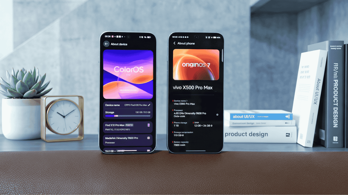
दोनों UIs को साथ रखकर देखने पर premium feel तो आता है, लेकिन दोनों की visual approach एकदम अलग है। एक तरफ OriginOS Liquid Glass aesthetic पर rely करता है, वहीं ColorOS Bouncy Spring Physics के साथ dynamic experience deliver करता है।
Visual Philosophy: Liquid Glass Texture vs Elastic Bouncy Physics
OriginOS और ColorOS दोनों modern widget systems और layered blur का use करते हैं, लेकिन animation rendering का तरीका अलग है:
- OriginOS (Liquid Glass Approach): OriginOS में real-time depth, refraction और frosted translucent glass textures का heavy use मिलता है। Widgets, control center और quick toggles open करते time background layered glass panel की तरह blur हो जाता है। इसका aesthetic look बेहद clean, cinematic और high-end feel देता है।
- ColorOS (Bouncy & Spring Physics): ColorOS का Aquamorphic animation engine mass और momentum पर काम करता है। Dock swipe करना हो, notification tray pull करनी हो या recent apps switch करने हों—हर gesture में एक natural rubber-band bounce मिलता है। यह animations screen touch को instant और lively response देती हैं।
Quick Comparison: Key Differences
| Feature / Metric | OriginOS | ColorOS |
|---|---|---|
| Design Aesthetic | Frosted Liquid Glass, High Depth, Minimal Layers | Aquamorphic, Vibrant Colors, Flat Modern Cards |
| Animation Physics | Smooth deceleration, Cinematic blur | Dynamic bounce, Elastic spring motion |
| Widgets & Layout | Modular dynamic components, deep customization | Balanced grid widgets, clean glanceable info |
| Gesture Response | Steady, consistent and refined flow | Snappy, interruptible animations with bounce |
| Control Center | Split control pane with glass cards | Fluid quick settings with intuitive toggles |
OriginOS: Sophisticated Visuals और Layered Depth के लिए
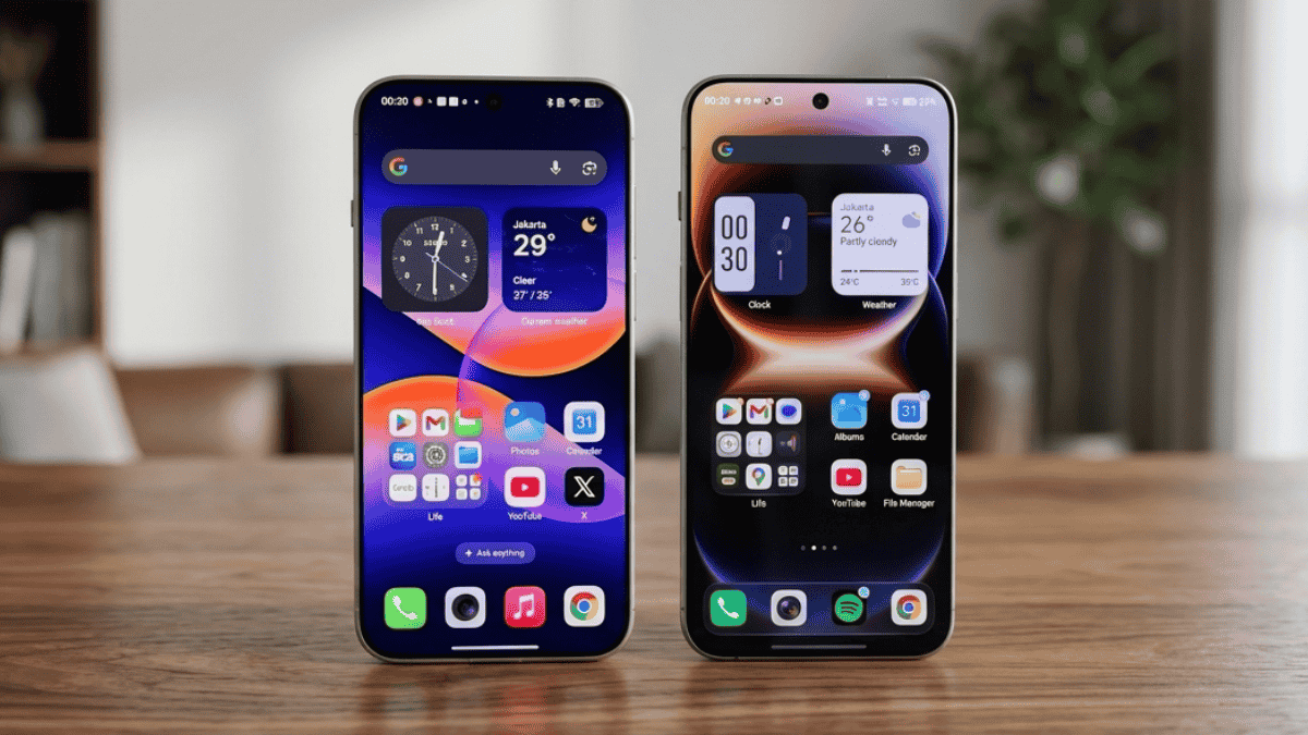
अगर आपको display पर clean typography, dynamic glass reflection और floating cards पसंद हैं, तो OriginOS का visual layout unbeatable लगता है। इसके translucent widgets background wallpaper के साथ natural depth create करते हैं, जिससे UI flat या boring नहीं लगता।
ColorOS: Fast Navigation और Playful Feel के लिए
अगर आपका phone usage heavy swiping, fast app switching और continuous multitasking वाला है, तो ColorOS का bounce physics engine ज्यादा satisfying लगता है। इसकी interruptible animations बिना किसी stutter या lag के user touch follow करती हैं, जिससे device super responsive महसूस होता है।
स्मार्टफोन software अब सिर्फ features तक limited नहीं रहा, बल्कि रोजमर्रा के use में animations और gestures कितने natural लगते हैं, यही flagship experience तय करता है। अगर आपको clean, frosted glass aesthetic पसंद है तो OriginOS visual treat देता है; वहीं dynamic responsiveness और bouncy feedback पसंद करने वालों के लिए ColorOS एकदम tuned है।
Daily usage में आपको किस तरह का UI flow ज्यादा पसंद आता है—subtle liquid glass look या responsive bouncy feel?
Source From X User Alvin